
You are using an out of date browser. It may not display this or other websites correctly.
You should upgrade or use an alternative browser.
You should upgrade or use an alternative browser.
cool font?
- Thread starter alinwa
- Start date
.jpg")
FBecigneul
Member
Since you inferred you were soliciting opinions, I’ll give mine. A kindergarten student could do better.
Since you inferred you were soliciting opinions, I’ll give mine. A kindergarten student could do better.
I'll try to be more clear in future..... I _thought _ I was specifically "asking" for opinions, not inferring.
Thank You for yours
")
Not a big fan. NOT bad, just not ‘it’
Generally my builds are such that I'm confronted with the age old "do what you want with it, you're the artiste"...... so I'm stuck with the age old problem of "does he love it?"
So I observe carefully and try to be wily and subtile like the sneaky and 'lusive foxsnake
Basically, if'n they don't light up like a kid with their first BB gun I've failed. So I chuck 'er back up and turn the letters off and start over, lose .008-.010 shank diameter.
I've also used Comic Sans and several Lucida fonts, not this one, Lucida has some cool calligraphic stuff, but most of mine are custom and not to be found on Wilbur's list
And then there's what I cal "the Olde Fuddy-Duddy fonts" where I exactly match the lettering on the receiver and the client gets all happy and yells "I love it! It looks just like it was made that way!!"
I smile thinking "this is a guy to whom "bespoke suit" means it's "not JC Penney, but it'll do"...."
LOL
Last edited:
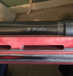
If it is a chambering that you could use to kill a T-Rex that is perfect. And a 378 wea. is just that.
That's what I was going for......
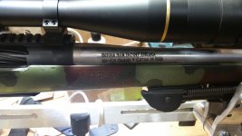
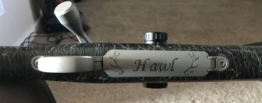
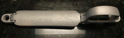
I just found this font called 'Wolves and Ruin' and I tried it out on a gun tonite......
NOT'cher typical Weatherby lettering but this guy's a burly elk-shootin' feller and this is most definitely a working gun.
I'm hoping he likes it
opinions?
View attachment 22525
Cool!!
Rick
My opinion could very well be based on the fact that I use a Famco P1-2 pantograph engraver and have all of....two sets of font. One plain old block letter and another one of fancy script. My choices are quite limited and I’ve only used the block letters now for 5 plus years. Maybe a bit boring I suppose so in retrospect, I like it


M
Mram10
Guest
Since you hold my opinion in such high regard, I’ll give it. Not a fan. I’ve used these and like them...
Monotype corsiva is my go to fancy font.
Monotype corsiva is my go to fancy font.
Attachments
-
 6EF1B3AC-3C0E-48DB-A4B1-BE2B14856640.jpeg498.8 KB · Views: 196
 -
 4D4F1FC7-C877-4C7C-AF01-58A23B785E2C.jpeg626.4 KB · Views: 168
 -
 5D26ED9F-8CE8-427D-A1AE-4A14FBBFA620.jpeg683.1 KB · Views: 176
 -
 75D7B204-6261-43FC-9179-CDA85AC8F094.jpeg668 KB · Views: 193
 -
 1D1DBDBA-3604-464A-AF7E-4032C3722342.jpeg678.4 KB · Views: 162
Last edited by a moderator:
Since you hold my opinion in such high regard, I’ll give it. Not a fan. I’ve used these and like them...
Monotype corsiva is my go to fancy font.
"Ya' cain't argue with the facts"
And the fact is, those look good..... Bravo